Cover Page Design
- Maarib Abbas Naqvi
- Jun 11, 2024
- 2 min read

I drew inspiration from a variety of magazine covers and attempted to replicate some of their characteristics, which are well suited to my design style. I creatively alter their design into my one-of-a-kind creation by including additional features.

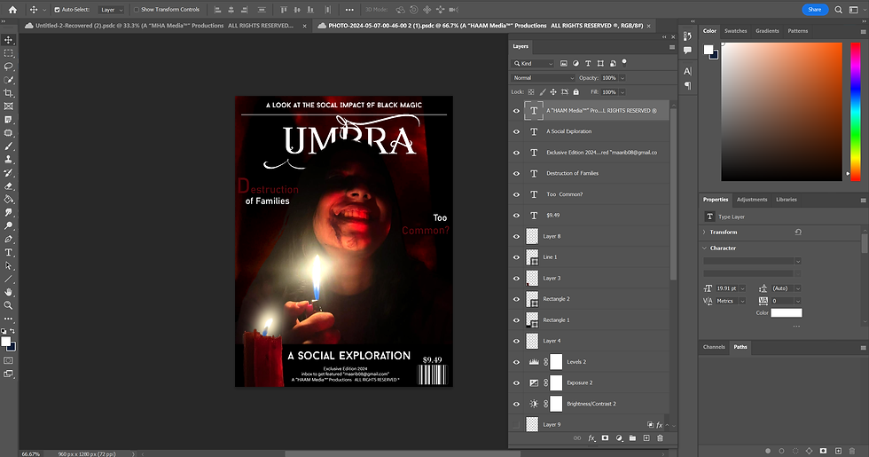
The Picture I picked For The Cover wasn't this dramatic and I colour-graded it to give the Dark and Intense Effect. I used mainly white black and red shades throughout the magazine consistently and it all started from here. Although at the start I wanted to pick a picture Which has the head of the Subject going behind the title of the magazine, I ended up using this picture because it had much more going on and was more interesting than the other one which seemed bland. Furthermore, the text behind the image also didn't look natural enough due to the dark lighting etc.
HERE IS THE REJECTED DESIGN
I left this unfinished as I had already made up my mind that this isnt it. I wanted a visually striking image with much more going on than just a lighter being held up, although the protruding candle was a good design choice.
on my final image, I started by doing colour-grading. I darkened the background and increased the contrast. Then using level graphs and hue saturation layers, I made the red more prominent. Moreover, I used a smoke brush to give more of a smokey effect.


as for the text, I made some interesting design choices. First off, I cut through the title as I saw in another magazine cover and it looked very visually appealing. I did this by first rasterizing the title layer and erasing the part I wanted to cut out. Also, I flipped the selling line on the top of the page to give the magazine a scarier and more intriguing look by striking resemblance to a flipped-over cross. this also requires the reader to pay more attention and stay more immersed. I also used various fonts and made one of the letters "bleed" by using a blood vector and warping it as required. I also used the candle from the previous design and sent it behind the bar and blended it so that the flame at the bottom doesn't look bare and throwing off (I also warped the flame to look more aesthetically appealing)


Comments