Preliminary Task
INSPIRATION
The magazines "World Travel" and "THE SUNDAY TIMES" inspired my cover story. Both of these have formal fonts and complementary text colors that contrast with one another. This makes it an ideal model from which to draw inspiration. For a magazine cover, the overall framing and composition of the text are polished and striking. In order to further evoke images, the cover also uses text behind the picture. To suit the requirements of the magazine cover, the typography also involved altering the text's font, size, and character spacing.


The Following article, which also has a scenario from a trip magazine with destinations and landmarks included in the photo, served as the inspiration for the feature story. Given that my magazine's genre and concept are likewise well-known, it is therefore a perfect notion to implement.
Mockups

Photography

Selected

Rejected
the selected image fits the frame better with a leading lines alignment while the camera is a little blurred and panned down a bit revealing a not so appealing look of the scenery in general

Selected

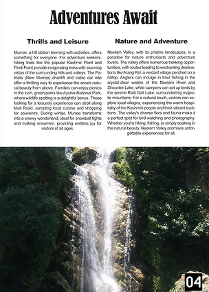
Rejected
the selected image has the waterfall centre framed while the other image is a little tilted and off-centre, you can also see more of the crowd of the people than the waterfall, which is our main subject
Design
Cover

Table Of Contents

Feature
Article

Files Used
PSD Files
Font Files
All fonts
All other fonts were directly available in photoshop


Evaluation of design
The design of my four-page travel magazine on the northern areas of Pakistan was crafted with a focus on visually capturing the stunning landscapes and cultural richness of the region. I utilized a clean and modern layout to ensure readability while highlighting the breathtaking imagery. Each page was meticulously designed with a balance of text and visuals, using large, high-resolution photos to draw the reader's attention and convey the beauty of the locations. The color scheme was inspired by the natural hues of the landscapes, with earthy tones and vibrant accents that complemented the photographs. Typography was carefully selected to be both elegant and readable, with distinct fonts for headings and body text to create a cohesive and professional look. Additionally, I incorporated graphic elements like borders and icons to enhance the aesthetic appeal and guide the reader through the content seamlessly.
Learning Outcome
Creating this travel magazine served as an invaluable learning experience, providing me with a practical understanding of design principles and their application in publication creation. Throughout the process, I honed my skills in layout design, photo editing, and typography, gaining a deeper appreciation for the importance of visual harmony and consistency. Working on this project allowed me to experiment with different design tools and techniques, expanding my proficiency in software like Adobe Photoshop and InDesign. I learned how to effectively balance visual elements with textual content to maintain reader engagement and ensure clarity. This project also underscored the significance of planning and organization in the design process, as I had to carefully curate content and arrange it in a way that was both informative and visually appealing. Overall, the experience significantly boosted my confidence in my design capabilities and provided a strong foundation for future projects.